Allen Jones RA
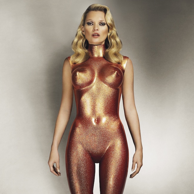
Allen Jones knows how to sell sex. Since he first exhibited his fibreglass women in the late 1960s – the prototype fembot, down on all fours, arse practically over head, strapped into bondage gear – he’s owned it. They were – are – the literal representation of sex-on-legs. And who’d have thought that the place to get a little artistic perversion in London these days would be at the Royal Academy?
It’s clear that Jones’ coterie of fetishised furniture sculptures represents a very specific sort of fantasy. It’s everyman erotica; pert tits, big lips, hard-bodied, submissive, available. Serving you cocktails, ready to take your hat. They’re expensive whores on all fours. Yet, even as a feminist, you have to relish in how aggressively politically uncorrect it all is. Jones makes incredibly, obviously, seductive art. And you might feel a bit grubby about it afterwards, but then we’ve all been there, right?
Jones’ paintings provide a little counter balance to the implied misogyny of his sculptures. In these colourfully kitsch scenes he paints about power-play with cross-dressing inferences, of the dominate female, the submissive male, of the animalistic rituals of mating and the delicate interplay of coupling represented in the form of dance. It’s the paintings and later sculptures that suggest a much more complex side to Jones than the ones his critics would have you believe. To reduce Jones to a fetish artist, means you ignore a lot of the richness and ambiguity in his work. And it’s this that makes you want to go back and take a second look at the sculptures – maybe it’s not all about oppression and submission, maybe there’s something deeper at play? Maybe it’s not a male-female thing after all. Maybe she’s in control. Hell, maybe she’s even enjoying herself. Imagine that.
Allen Jones RA is at the Royal Academy, London until 25th January 2015
royalacademy.org.uk
IMAGE CREDIT: Allen Jones RA, Body Armour, 2013 Photograph, 127 x 127 cm London, Private Collection / Image courtesy of the artist © Allen Jones
Tags: Allen Jones, Art, fashion photography, Royal Academy
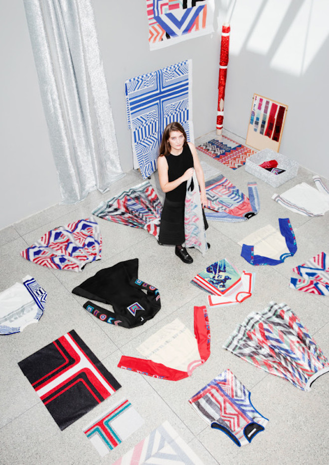
& Other Stories Co-Lab Collection by Sadie Williams
& Other Stories are no strangers to a great Co-Lab (as they like to call them), and their latest comes in the form of shimmering textures, fuzzy wools, sporty shapes and glitery details, all designed by Sadie Williams. The glitz and glamour comes just in time for the festive season, making that decision of what to wear that little less daunting.
sadiewilliams.co.uk
stories.com
Tags: & Other Stories, Sadie Williams

GIRLS IN FRAME
London-Los Angeles denim brand FRAME has added to its series of shots inspired by Andy Warhol’s iconic screen prints, entitled GIRLS IN FRAME. Devised by Jens Grede and Erik Tortensson, the project was intended to celebrate the launch of its t-shirt for autumn/winter 2014.
The latest model to join the series is Australian model Phoebe Tonkin. This recent instalment accompanies the release of FRAME’s resort collection, launching in stores now. Grede and Tortenssion hosted a star-studded dinner to celebrate, with Karlie Kloss, Elin Kling, Tali Lennox in attendance, to name but a few.
FRAME’s chic, minimal style has already garnered followers including Cara Delevingne and Rose Huntingdon Whiteley – this creative campaign is sure to secure them a place at the head of the pack.
frame-denim.com
Tags: Denim, event, Fashion
Pärla
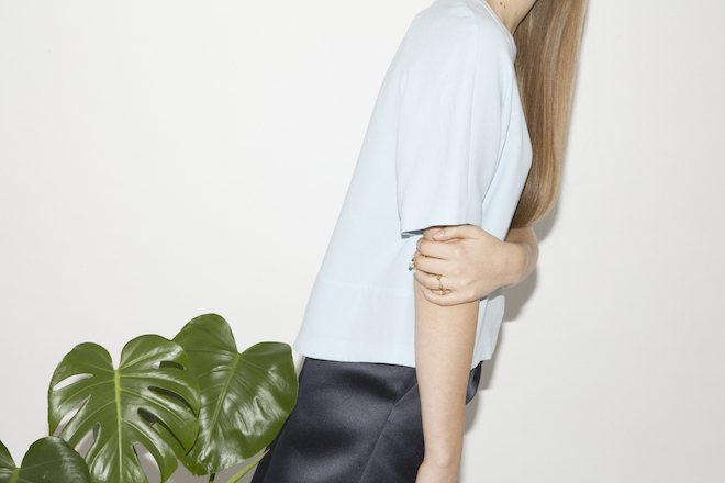
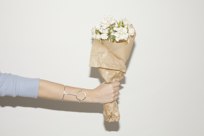
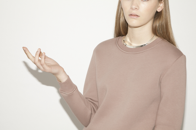
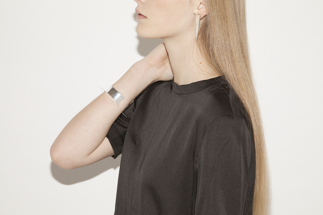
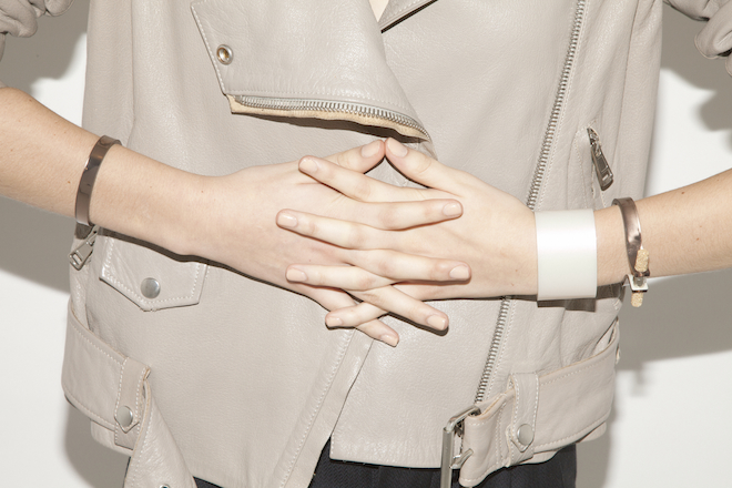
It was the loss of her favourite gold necklace that caused Erin O’Connor to want to open her own store. Realising first hand just how attached to jewellery we are – how they hold such sentimental value – she knew what she wanted to do. Nearly one year later, Pärla is becoming the go-to boutique for contemporary, hand-made jewellery.
“I love good quality, simple design with clean shapes and silhouettes, and how jewellery can really bring that to life,” states Erin as we sit down to talk all things Pärla. This scandi sensibility is very clear to see when you walk into the Boxpark store, “It’s something I’m very passionate about, working with products and people I love.” When buying stock, her considered approach leans towards versatility, picking pieces that can be interpreted in different ways. The name Pärla reflects this; not only does it mean pearl in Swedish, but it can also be translated to mean gem or jewel too.
The eight designers she represents are all establishing themselves, and Erin has created a close-nit family and a place for them to support each other. What about other brands on her radar? “Acne and Celine; I love the cuffs they’ve created this season. And Moxham, I think [Maddie] is very talented, her pieces are so cool. Like V Jewellery and Jessie Harris, you can style it in your own way” As for the high-end brands, we’ll have to wait, as accessibility is key for Pärla. “Whether you’ve a gap in your wardrobe or looking for a gift, tell me your budget and I’ll find you something.”
It’s this personal shopping service that makes Erin, and her boutique, stand out. Her close relationship with the designers allows her to go the extra mile for those wanting to purchase the perfect little something. Maybe the chain on a necklace is too long, perhaps you’d like a certain ring in silver not gold, or you’d like something engraved. All these little changes are possible at Pärla. As is opening the store at 8am to try on jewels on your way to work, “whatever you need – I’ll sort it.”
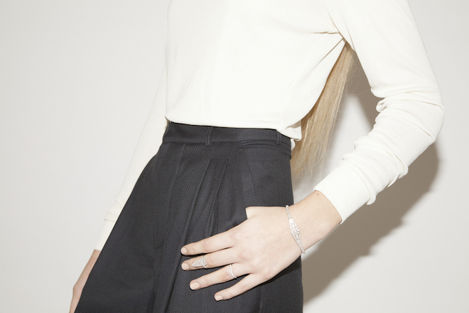
We couldn’t leave without talking current trends, and Erin confirmed our suspicions, chokers are the thing. Has her personal style changed since surrounding herself with these great designers and brands? “I’m a lot more open minded when it comes to jewellery now. I used to only wear gold, now I love to mix and match. I’ll even pick my jewellery before I pick my outfit now.” And what about that one piece, the one you’d wear if you could only wear one forever? “That’s a tough one, but I’d wear my [V Jewellery] Spine Ring forever. It’s so easy to wear and goes with everything.”
parlaonline.com
Tags: Jessie Harris, jewellery, Moxham, Pärla, V Jewellery

The Magical Christmas Journey by Burberry
On 6 November, Kate Moss and Cara Delevingne unveiled a new creative concept that saw Burberry take over the windows, façade and atrium of the iconic Parisian department store, Printemps. Burberry did something undeniably brilliant by pairing Kate and Cara together for a host of ad campaigns, but this latest venture is enchanting all by itself.
‘The Magical Christmas Journey by Burberry’ is the story of a little boy and his teddy bear, as they make the journey from the flagship Burberry store on Regent Street to the Printemps store in the heart of Paris. The eleven windows feature a cast of handmade puppets – the little boy, his teddy and Printemps’ exclusive Bubsy characters – wearing items from the Burberry limited edition Printemps collection.
Ten beautifully executed scenes allow you to follow the little boy as he flies over the English countryside, crossing the Channel on an upturned Burberry umbrella. He and his bear help the Busby puppets sort Christmas gifts before alighting on the roof of the Printemps store and forming a Christmas Choir, and finally, settling at the Christmas table surrounded by Burberry gifts and evening wear.
Social media, too, is being leveraged to make this an extra-special display. Using smartphones, visitors are able to interact with the individual scenes and control their own vantage points, create their bespoke journey and send images from the built-in cameras within the windows directly to their phones. The beautifully festive scene can instantly be turned into a digital postcard, which can then be shared across social media. And for those who aren’t able to visit Paris, the journey can be seen on Burberry’s streams on Twitter and Facebook.
Festivity aside, the display marks the launch of the exclusive Burberry collection of limited edition pieces which have been designed for Printemps, including ready-to-wear, trench coats, accessories, special gifts and collector’s items which all feature in the window displays, as well as Burberry Beauty gifts and the My Burberry fragrance and make up box sets.
burberry.com
printemps.com
Tags: Burberry, christmas, Printemps
Vivianne Sassen Analemma: Fashion Photography
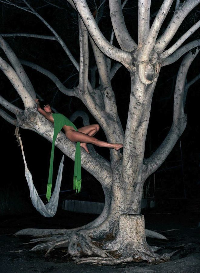
Flourishes of dynamic movement, of fabric that bursts out of the frame like a blossoming bud, and a peak of flesh teasing from underneath… Vivianne Sassen’s fashion portraits offer a lavish antidote to over-exposed minimalism. Hey there colour, welcome back.
Currently on show at The Photographer’s Gallery as part of their fashion season, Sassen’s Analemma series makes the body a vehicle for movement, albeit captured in a static photograph. With her crackling eye for shape and form, Sassen creates little fashion aliens out of her subjects. These beautiful freaks, with their saturated skin-tones wrapped in voluminous swathes of fabric, can be found striking a pose against a surrealist landscape or moulding their bodies into sculptural installations. Their composition owes much more to art history than to contrived fashion formulae.
Mirroring the performance element of her shoots, the 350 or so images on view are presented in a sweeping swirl of movement; projections slide across the walls and floors in a constant loop of motion. And the colour literally blooms from her photographs. Sometimes it’s sharp and graphic, cutting a bold, clashing contrast of dramatic shapes and hues. Other times it’s present as a beautifully tonal and subtle spectrum. It’s Sassen’s non-conformity, her ability to eek-out every single droplet of pigment and her contextual references to fine art, that mean her work can not be confined to, or defined by, the fashion industry.
It’s funny that colour seems to have taken on an avant-garde status in fashion, but here’s to the industry’s current renegade and her eye-popping palette of human sculptures.
Vivianne Sassen Analemma: Fashion Photography 1992 –2012 is at The Photographer’s Gallery until 18 January 2015.
thephotographersgallery.org.uk
Tags: fashion photography, The Photographers Gallery, Vivianne Sassen Analemma
Bella Freud x The School Of Life
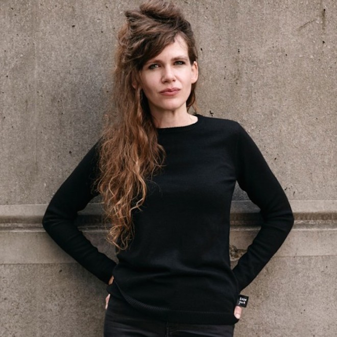
Bella Freud has collaborated with The School of Life to create a collaboration centred around the world’s most iconic thinkers. Together they introduce ‘The Philosopher’s Jumper’.
Looking back through time, into the wardrobes of intellectual heroes as diverse as Herbert Marcuse, Iris Murdoch, Simone de Beauvoir and Jean-Paul Sartre, they found one item in common – the black jumper.“The black jumper is the ideal suit of armour to contain you while allowing you to free your thoughts,” states Bella Freud. “For all its simplicity there is nothing more alluring than a perfect jumper in black merino wool.”
The Philosopher’s Jumper is available now from theschooloflife.com
Tags: Bella Freud, Philosophy, The School of Life
Just Grow It
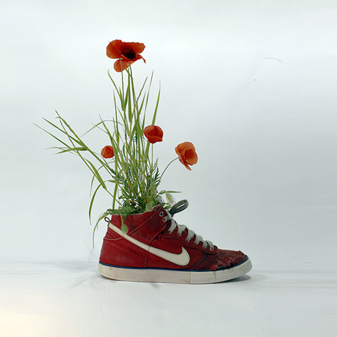
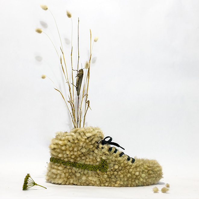
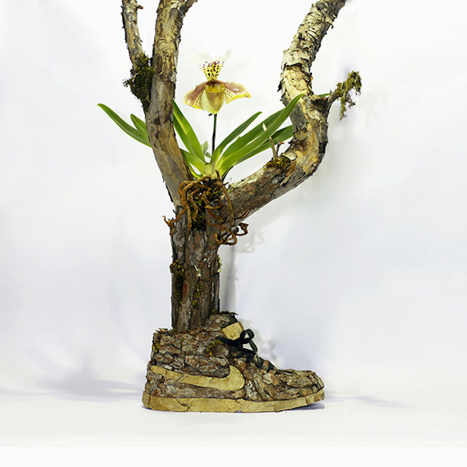
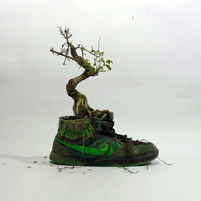
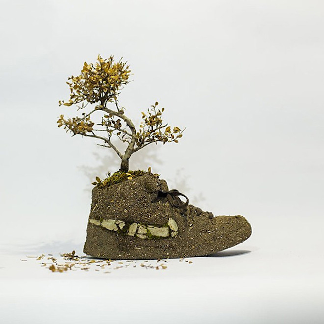
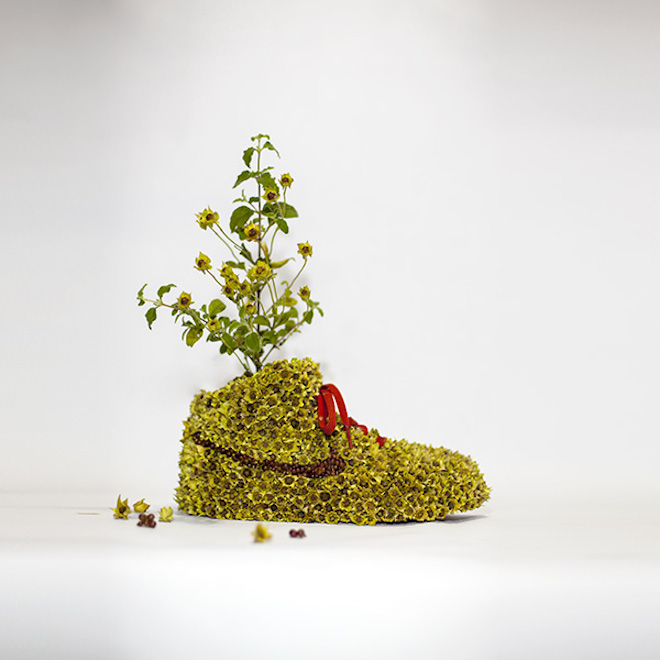
It’s not exactly news that trainers are having a renaissance of sorts in the fashion world, so it seems fitting that a Parisienne artist has made them the central theme in his work. Christophe Guinet, aka Mr Plant, has turned Nike’s moto Just Do It into Just Grow It, and created a series of living plant sculptures that feature mid-top dunks adorned with flowers, grass and bark.
To see more, head to Mr Plant’s website epiphytegarden.com
If this floral arrangement takes your fancy, Nike have recently launched a more wearable collection with Liberty. Available to buy from liberty.co.uk
Tags: liberty, Mr Plant, Nike
Prada Resort 2015
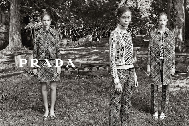
Prada introduces new faces Adrienne Juliger, Ine Neefs and Moya Mardy in their eerie Resort 2015 campaign. Shot by Steven Meisel, and with hair and make up from Guido Palau and Pat McGrath, the result is a enigmatic monochrome portrait of the modern Prada woman.
The collection itself focuses on the new shapes; silhouettes made from short jackets, boxy skirts, pleated trousers and belted dresses, all with a slight nod to the 70’s. The fine details, such as decorative stitching over the seams of each garment, shoe and bag are clear to see in the photography as well as the tension building short video.
prada.com
Tags: prada, Resort 2015, Steven Meisel

An Infernal Demand
To celebrate All Hallow’s Eve Paul Franco directed this spooky fashion film, written and produced by Ella Rosa Hart exclusively for Twin.
The tongue-in-cheek short stars Jessamine Bliss Bell as ‘The Girl’, dreamt up by three ad execs as they try to come up with something chilling for their Halloween pitch. We follow her on a strange and bizarre journey, watching the spooky events unfold.
Happy Halloween!
Director: Paul Franco
Producer & Writer: Ella Rosa Hart
Stylist: Hannah Sheen
Tags: Ella Rosa Hart, Fashion Film, Halloween, Hannah Sheen, Jessamine Bliss Bell, Paul Franco
Twin Picks: Neoprene
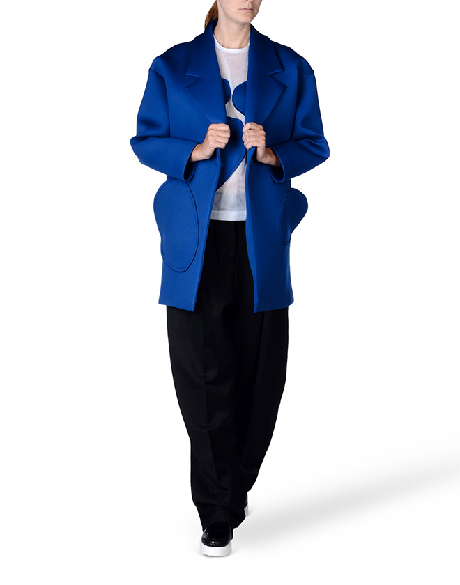
Neoprene made its way into our wardrobes a few seasons ago, and it hasn’t left since. Autumn/winter 2014 sees the trend evolve along with the sports lux style, both are becoming more sophisticated and designers more adventurous with the material. Here we have picked out one ensemble for you to go head-to-toe scuba. Or wear individually. That part is up to you.
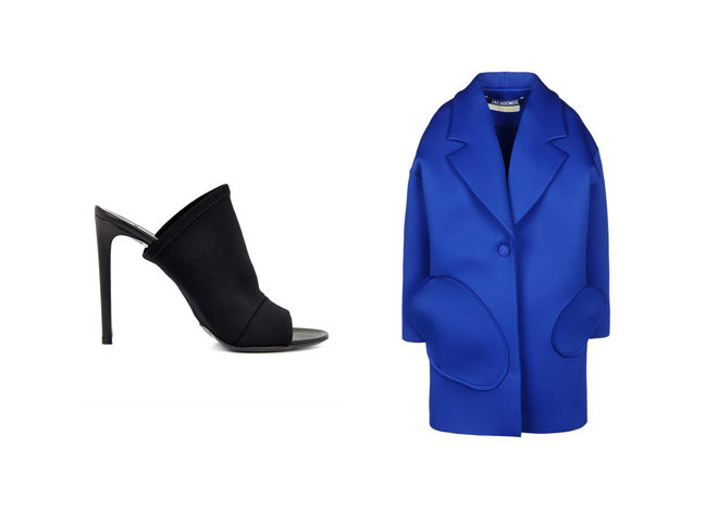
Balenciaga Neoprene Glove Mules, £415, matchesfashion.com & Jacquemus Neoprene Full Length Jacket, £508, thecorner.com
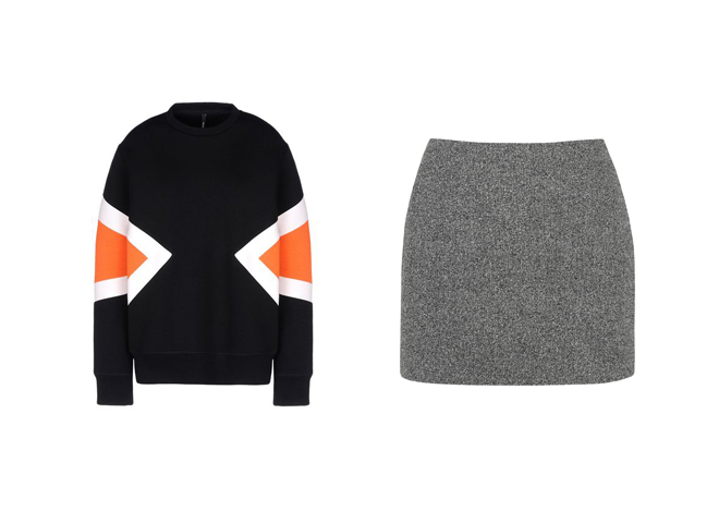
Neil Barrett Geometric Design Sweatshirt, £260, farfetch.com & T by Alexander Wang Mesh-Bonded Neoprene Mini Skirt, £180, net-a-porter.com
Tags: AW14, Balenciaga, Jacquemus, Neil Barrett, Neoprene, T by Alexander Wang, Twin Picks
In Conversation With Robert Storey
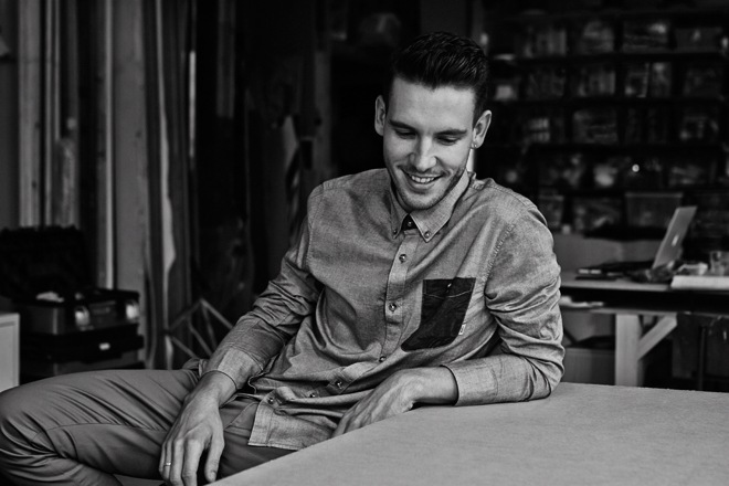
Robert Storey considers himself an artist first and foremost. With the work that he does and the brands that call upon him for set design, who’s to disagree? Having worked with the likes of Opening Ceremony, Nike, Louis Vuitton and Browns Focus (the list goes on), as well as contributing to previous issues of Twin, Storey has quickly carved out a very well-respected place for himself in the industry, were people come to his studio to get that Storey spin on their projects. Twin visited the creative at his studio to talk furniture design, New York and his very first job.
Were you always a creative person?
I was always creative as a kid, always most engaged in art classes or when I was at home. When I wasn’t playing outside with my brother, I was drawing something like a plant that I had brought inside or making something in my dad’s workshop from wood.
What does your dad do?
My dad is a businessman, but he’s an amazing carpenter – really creative, so I grew up around that.
How did you go from sculpture to set design?
I was assisting some artists in New York. I really loved it there so wanted to stay but I couldn’t assist the artists any longer. I then met this guy who was an agent at M.A.P., and he’d had an English set designer come over called Janine Trots. He said I should just work for her for a bit and see if I enjoyed it, so that was a good reason to stay. When I came back to London she set me up working with Shona Heath, so I worked for her and then kind of just rolled into being a set designer. It was quite organic.
If you had the choice, do you think you would have decided to set up your own studio in New York?
I had to come back because of my visa but I always hoped to go back to New York and then set up a studio there. I actually just got my visa to go to America so I can go now, but I’d like to try and be transatlantic rather that based in New York or based in London. I think it’s nice to be in both places as they both reward you in different ways.
What is it about New York that you like?
I think that year that I spent there was really, what’s the word, formative. I made a really good group of friends and I think those people will always draw me back because I like their company. I like how fast paced New York is and there’s always a new restaurant. Everything’s so convenient, if you live in Manhattan or Brooklyn it’s easy to get anywhere and it’s easy to work there. Everyone’s super on it, no one’s faffing around and if they say they’re going to do something, they’ll do it.
A bit different to London.
Yeah it’s all a bit slower in London. You have a meeting and then another meeting before anyone can actually do something. Which I love as well, I’m English and I’m used to that way of working, but I like that immediacy.
Tell me about your first solo gig as a set designer…
There was a guy that was working at Studio Private in Shoreditch producing a shoot, that knew I was doing set design, but he literally needed a really simple backdrop painted and asked me if I wanted to do it. I was really keen; I’d turned up to the meeting with loads of different samples I’d done. Now I wouldn’t even give a sample, but back then I would be drawing all of these different squares and doing different textures inside them. Josh Olins, who was shooting, picked his sample but somehow – I think because I was a bit nervous – I left all my samples on the table and another photographer came to the studio right after my meeting and saw them. He called me asking me to paint a backdrop for him, and then it just rolled on from there really. It was quite quick.
When you’re working on a project, do you get creative freedom or would you say it’s a more collaborative process?
I think increasingly there’s more creative freedom. Because I have developed quite a strong style people come to me because they want what I can give them. I can definitely produce anything and if someone’s got a really strong idea I’m happy to sit back and do it the way they want me to do it but I think, luckily, we get a lot of projects where people want us to put our own stamp on whatever the project is.
So how would you describe your style?
I think there’s a lot of architectural influence. It’s well balanced; there’s a lot of symmetry, a lot of geometry. I always try to make it feel really quite simple even though it’s really complicated.
You do more than just set design; you’re working on brand identity and art direction. Tell me more about what Robert Storey Studio does?
I think the term set design is quite tenuous, just because of the fact that my studio is a creative studio and I come from an artistic background and I consider myself an artist first and foremost. But beyond that we do work with brands to create an identity for them or enhance the identity that they’ve already created for themselves. But I mean like furniture design, interior spaces, pop-ups, runways shows, we do everything.
Is there one thing that’s your favourite?
Everything’s my favourite! I mean if I had to pick, I’d probably do still life but I think I love the diversity of doing a runway show one day, then a tiny still life the next and then a massive shop-build somewhere else. It keeps me on my toes.
What’s been your favourite project to date?
My favourite project would be the Nike [Womenswear Pop-Up] in New York – it was really special.
You’ve got a collaboration coming up with Quentin Jones. Tell me a bit about that?
Quentin and I have been working together for over three years now so we have this really lovely collaborative relationship. Quentin had been asked to do a presentation, like a mini retrospective of her work. She approached me to make the set for it because I know her work better than anyone else who would make a set for her. She’s great, she kind of let me go off and do my own thing and when she came back to it, she loved it, and so it’s been really easy. It’s one of those love projects really.
What are you working on other than that at the moment?
We’ve just started the Christmas windows for Matches. We’re doing it in all six of their stores for Christmas. We’re working on a project for Uniqlo in New York and Tokyo and Paris. We’re doing a few still life stories and we’re doing the Christopher Kane shop in Harrods.
Who would be the ultimate client?
Well Nike was my ultimate client and then I got it, and also Christopher Kane. I really, really want to design a space for Comme des Garçons because I think they have a really innovative, unique approach to how they expect their audience to experience the space. So I think I’d have a lot of freedom to do something really experiential with them. I think Comme des Garçons would be a good one for me.
You mentioned furniture design, what kind of things would you want to build?
My work is all about the space, and filling that space so it’s seems a natural progression to design the objects that go within it. Obviously we design these structures that go into spaces at the moment. I think the more the studio progresses, the more we’re doing the retail spaces or possibly residential spaces; it wouldn’t make sense for me to have another designer design a chair for a space which I have a complete vision for. For me, a chair is just as important as the wall in the space or the image that goes on the wall; it’s supposed to be a collective consciousness.
So what does the future hold for Robert Storey Studio?
I guess to continue this stream of my transatlantic workflow, and to eventually make some furniture of some sort. I’d love to do some collaborations with furniture. I think we need a brand to come to us like Vitro or Ikea to say ‘we want to design a range of chairs’. I’d love to do a really big collaboration project with a really big brand. I have an obsession with big American brands like Levis. Any kind of brands where we can put our name to a project, like Robert Storey x Levis or Robert Storey x Vitro.
storeystudio.com
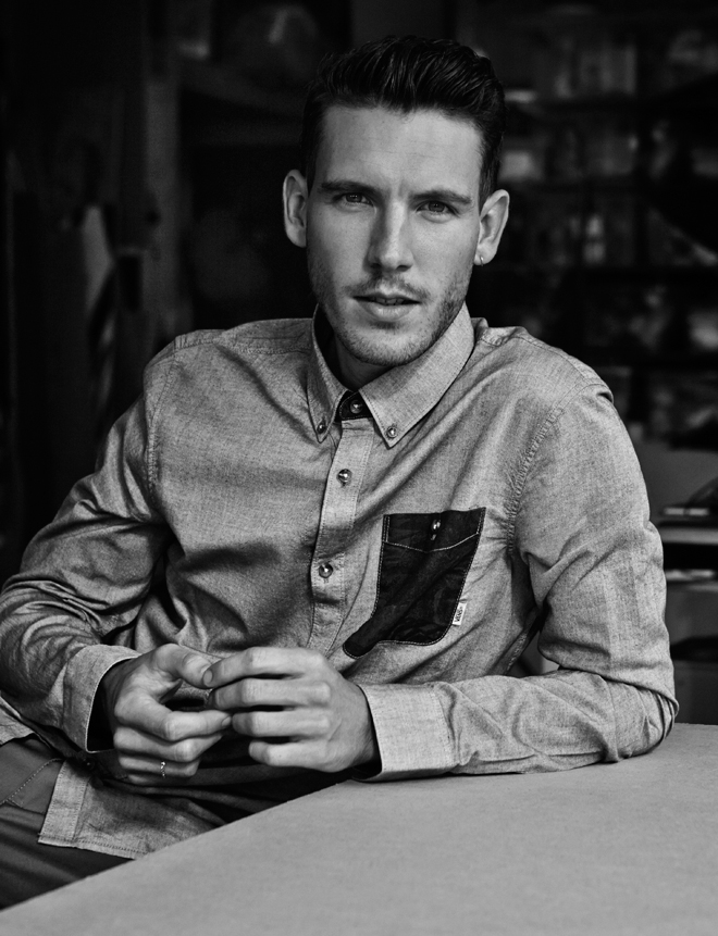
Photographer: Robert Harper
Stylist: Coline Bach Styling Assistant: Susanna Cavallaro
Grooming: Meggie Cousland
Photography Assistant: Pablo Marks
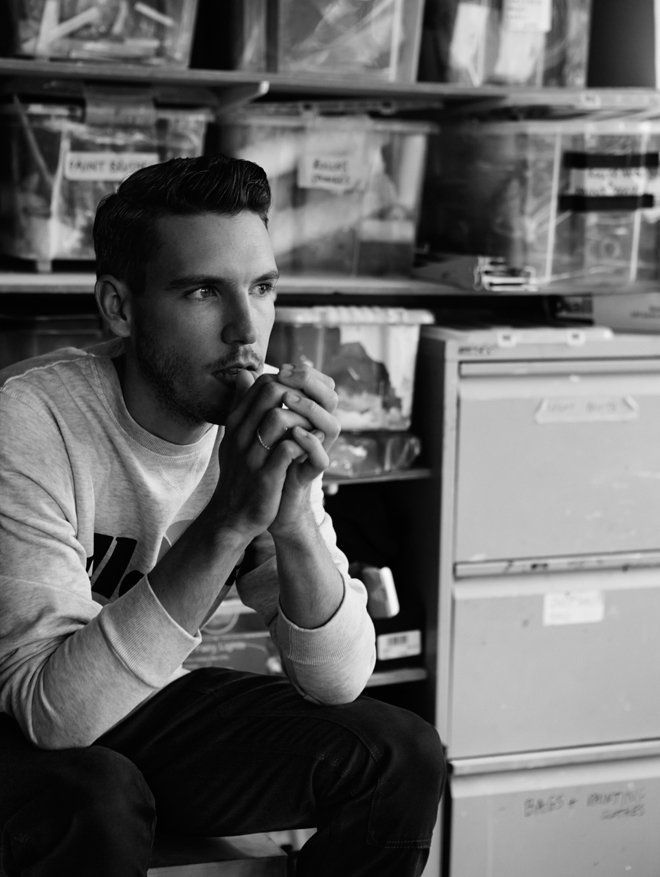
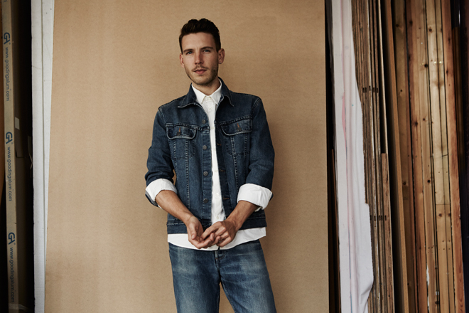
Robert Storey wears Ellesse sweater, Carhartt trousers and his own ring in image one; A.P.C. denim jacket, shirt and jeans in image two and Vans shirt and Carhartt chinos in image three
Tags: Robert Storey
Moxham x Whistles
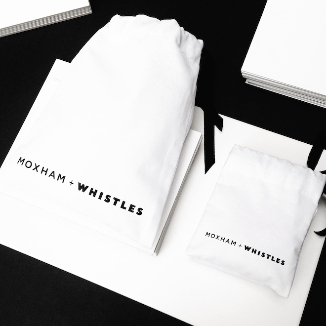
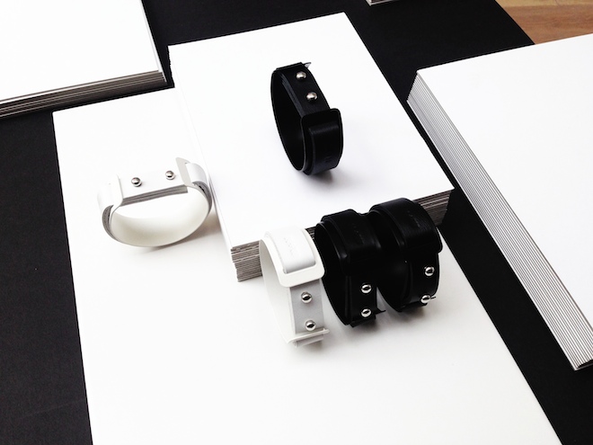
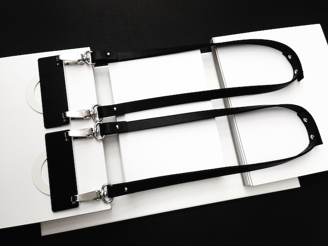
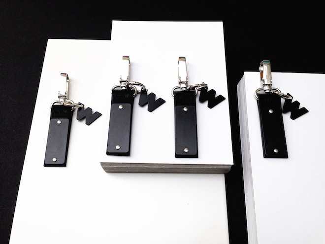
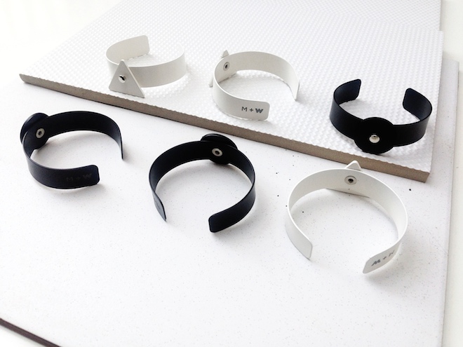
Twin favourite Moxham has collaborated with ‘it’ high street brand Whistles to create an exclusive eleven-piece collection, released today.
Madeleine, the creative mind behind the London based jewellery and accessories brand, has fused together the sophisticated, clean-line aesthetic we’ve come to know and love from Whistles with her own minimalistic sensibility to construct a range full of simple motifs and geometric shapes in a monochrome palette. The capsule features long necklaces, collars, cuffs, leather clips and a headband – signature Moxham pieces that have been reinterpreted using a W / M motif – that are all made from hand-cut leather and laser-cut metal with a powder coated finish.
Always interpreting the individual, the pieces can be detached and alternated, making each one personal and able to reflect the wearer’s own style. It is this element of design that makes Moxham a brand worth paying attention to.
Moxham x Whistles is now available in stores, as well as online here.
moxhamstore.com
Tags: accessories, Moxham, Whistles
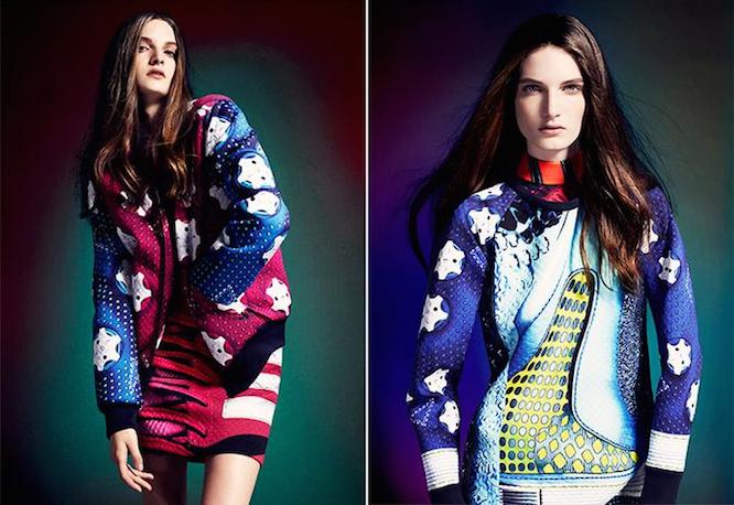
ADIDAS ORIGINALS X MARY KATRANTZOU
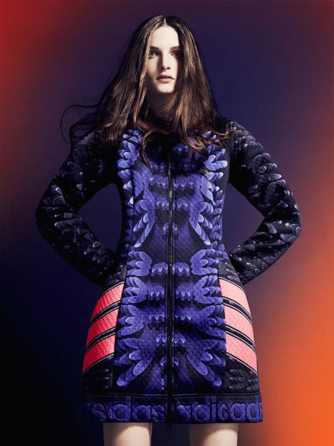
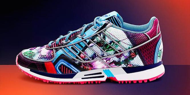
Mary Katrantzou has gone from strength to strength since her arrival on the fashion scene just a few short years ago, and her latest collaboration with sports favourites Adidas is no exception.
Hitting stores November 15th, the collection sees apparel and footwear transformed by abstract florals, stripes and laces. The inspiration behind the zip-up dresses, neoprene tops and kaleidoscopic footwear was feminine strength at every age.
‘This collection has encouraged me to push the boundaries of what is possible technically,’ says Katrantzou, ‘That’s something I will incorporate into future collections.’
marykatrantzou.com
Tags: adidas Originals, Designer Collaboration, Fashion, Mary Katranztou
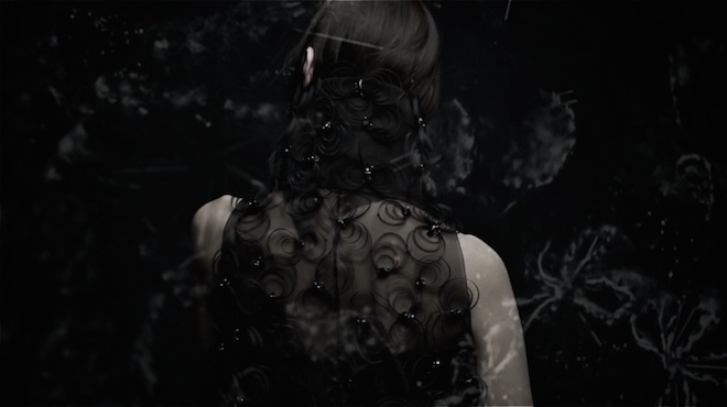
Chanel Revue’14
This dramatic short from director Trevor Undi beautifully documents the last two years of the House of Chanel. With an orchestral score composed by Gabriel Yared, the film showcases intimate behind the scenes footage with many a famous face. It revisits memorable campaigns, international events and spectacular archival footage from Karl Lagerfeld’s design house reminding us just how significant Coco’s legacy remains.
chanel.com
Tags: Chanel, Fashion Film, Trevor Undi

This Is What A Feminist Looks Like
ELLE has teamed up with Whistles to create a capsule collection of pieces that are all emblazoned with ‘This Is What A Feminist Looks Like’. The slogan was created by the historic Fawcett Society, the UK’s biggest equality campaigning group, and has been worn by well-known feminists such as Tracey Emin, Kirsty Wark and Shami Chakrabarti.
The T-shirt from the range is available to buy now from the premium high-street brands website, and the rest (sweaters, phone cases and a clutch) will be released on the 30th of October, with all proceeds going straight to the Fawcett Society.
fawcettsociety.org.uk
Tags: AW14, Fawcett society, Feminism, Whistles
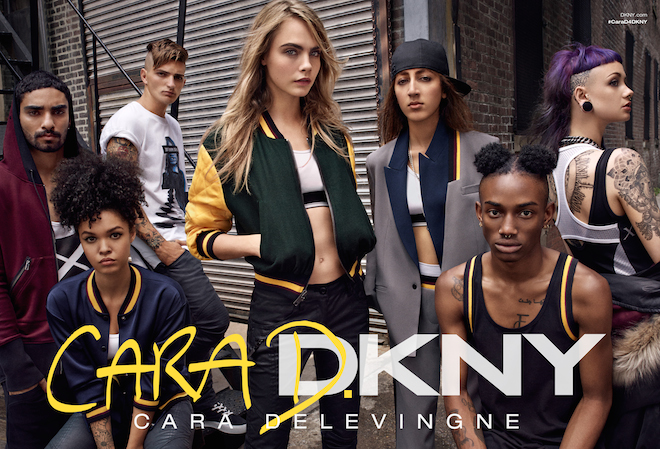
Cara D. x DKNY
Cara Delevingne has made her first foray into design, collaborating with DKNY on a 15 piece capsule collection. Taking inspiration from the street, the social-media-savvy model focused on beanies, bombers and crop tops. She also got involved with the casting of the campaign models, taking to Instagram to find the boys and girls that would model beside her: “There are 15 pieces to play with—no rules, no ‘looks,’ just opportunities,” wrote Delevingne, who penned the press release herself also.
Cara D. x DKNY is available to buy now from thecorner.com
Tags: AW14, Cara Delevingne, DKNY
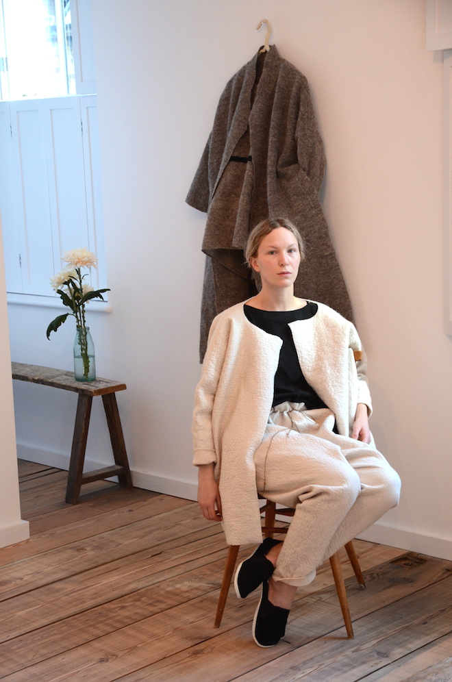
Later Alone She Wore Poems for Clothes
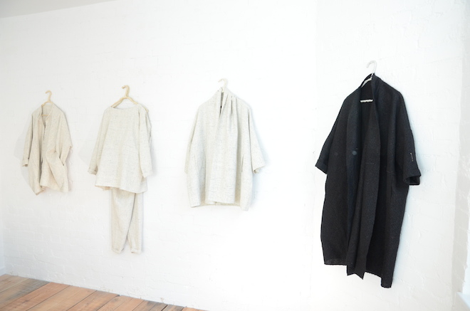
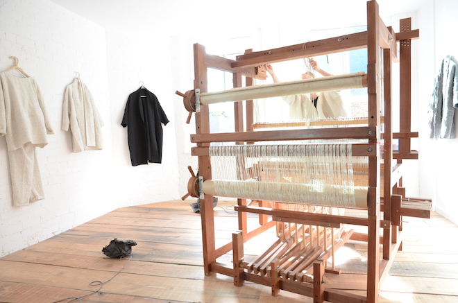
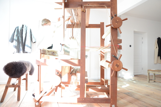
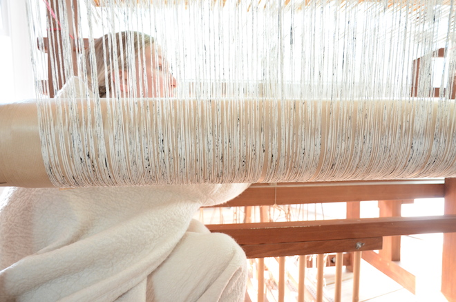
East London boutique Hostem has invited artist Amy Revier to perform in store for a week. To perform, the Texas born artist has installed her traditional floor loom in a studio space set in the concept store where you will find her, morning to evening, weaving textiles that will be sewn into a garment. Revier has also woven a collection of pieces specifically for Hostem, installed in the space for the duration of the exhibition. This will be the first time a large body of her work will be shown together.
“Old ways are retained not out of a sense of nostalgia, but because they serve a function,” states Revier. “I am interested in building from scratch, showing evidence of the hand, and in the plain beauty of well-made things.”
Working single-handingly to weave 3-5 garments a month in her North London studio, Revier’s pieces are intricate and beautiful. And with the materials being sourced from Kyoto-based spinners, most of which are hand-dyed and in limited stock you are left with a highly covetable luxury item for life.
Later Alone She Wore Poems for Clothes is open from the 16th-20th October.
hostem.co.uk
Tags: Amy Revier, Art, Hostem
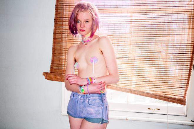
hi you are beautiful how are you
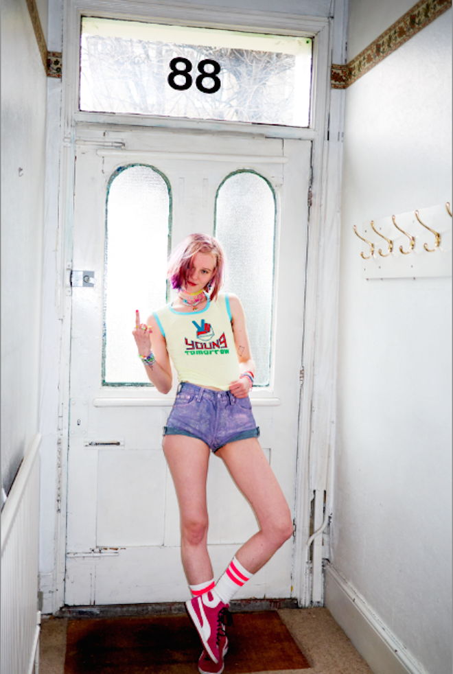
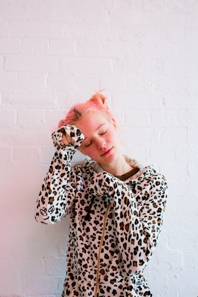
hi you are are beautiful how are you is the product of a two year relationship between photographer Valerie Phillips and Swedish artist/model Arvida Byström.
The pair was initially introduced by a mutual friend who predicted the creative collaboration that followed; Phillips and Byström first met on Skype before eventually working on 3 zines together.
As a photographer, Phillips likes to observe her subjects in their natural environment, living the lives they lead. hi you are beautiful how are you does exactly that, with Byström as the focus. She becomes all the more intriguing because of her eccentric lifestyle and fashion choices.
The result of this quirky friendship is a narrative portrait of a young feminist, questioning modern ideas of beauty and demeanour.
valeriephillips.com
Tags: book, photography, Valerie Phillips
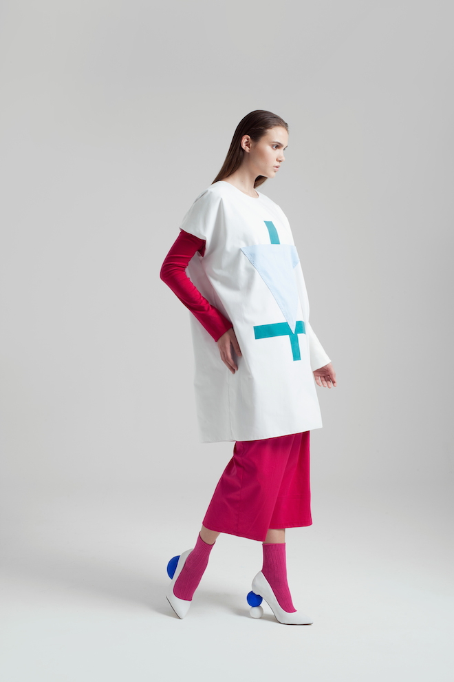
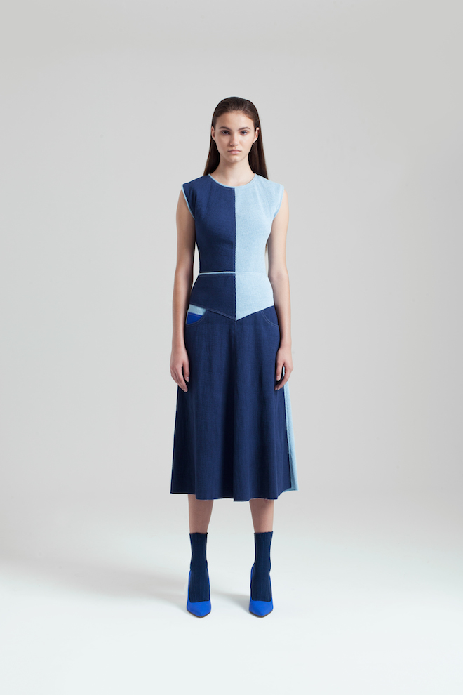
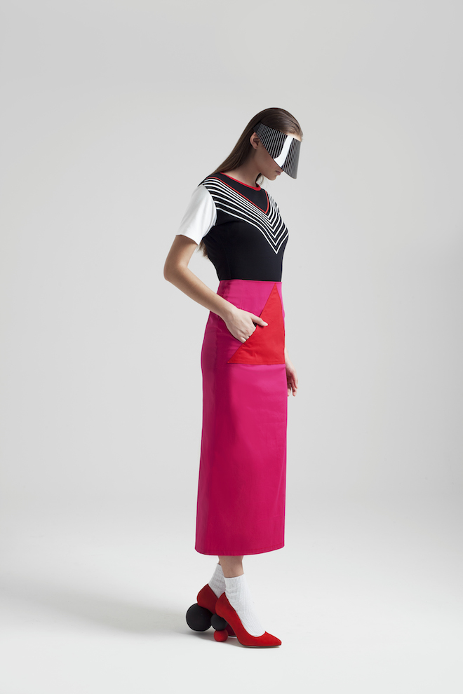
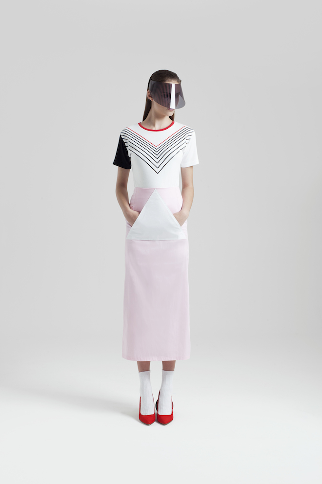
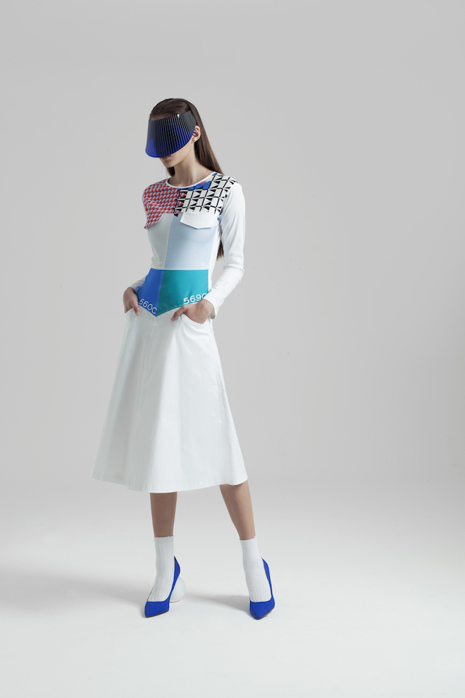
Timur Kim SS15
St Petersburg native Timur Kim continued to hone his signature patchwork technique for SS15, as seen at LFW last month. Updating denim with digital prints, the show saw models marching down the runway in pleats, tailoring and clean silhouettes.
With the precision of an architect, Kim focuses on the structural integrity of each garment. Each item is handmade in his Dalston studio, where he produces both his RTW collections and one-off bespoke pieces.
Having worked with fashion greats including, Alexander McQueen, the fusion of bold colour and striking shapes in his latest collection has a distinctly retromodern feel that is uniquely Kim’s own.
timurkim.com
Tags: LFW, SS15, timur kim


 PREVIOUS
 Twitter
 Tumblr
 YouTube
 Facebook
 Instagram
