The Fractured and the Feline is a new exhibition opening at The Vinyl Factory today. It showcases the work of multi-media artist Quentin Jones in collaboration with innovative spatial designer Robert Storey, both of whom are previous Twin contributors. The show itself proves to be Jones’ most comprehensive and varied to date, as it delves into her work on paper, in sculpture, film and photography. Storey creates a unique world for her pieces to be displayed, giving us intriguing spaces to explore.
We caught up with the artist to find out what to expect.
Tell us about a little about the showcase…
Lots of the exhibition is work that may have been seen somewhere in some form, but in its layered up, painted on, collaged natural form. Its a chance for me to show people my process, that is surprisingly art-based and hand made. One of the main focuses of the show will be a series of large scale works that no one has seen before… because I am still working on them. I am playing with the idea of blowing up my collages 10-fold and working back into the image at a level of detail I usually wouldn’t be able to – and having the fluidity of paint at that scale.
Oh and one of the coolest parts of the show will be the film rooms – Robert Storey who is designing the whole space for the show has come up with a really cool way to warp and reflect the films multiple times. His whole vision for transfroming the space is amazing and so cool for us to be collaborating in a more physical way than usual.
How would you personally describe your style of work?
Messy, montaged, quick, accidental, planned and exploring contrasts.
You’ve worked with Robert Story in the past, was he an obvious collaborator?
Yes he was the only person I wanted to work with in this space. He has a very architectural approach to design and his minimal structures are perfect for my chaos to to sit within. We both like things to be graphic and strong rather than subtle and ‘pretty’ and both have an outlook that straddles fine art and fashion.
What was it like working with Robert on this particular show?
So far very simple – we have worked out what we both want to show and how it can exist together. But the real fun will be in the installation weeks, when we will make many of the decisions for the show. We like to work quite spontaneously.
The Fractured and the Feline: Quentin Jones with Robert Storey is presented by The Vinyl Factory at their space in The Brewer Street Car Park, London from 19 November to 13 December 2014.
thevinylfactory.com
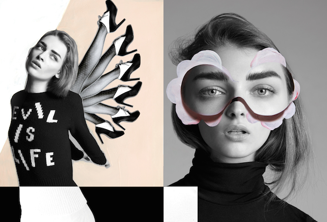
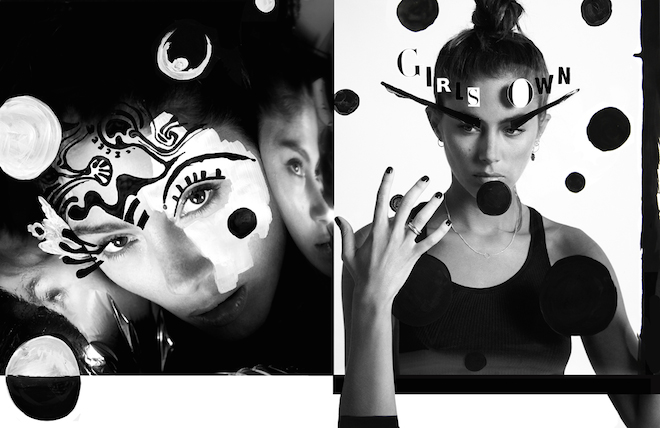
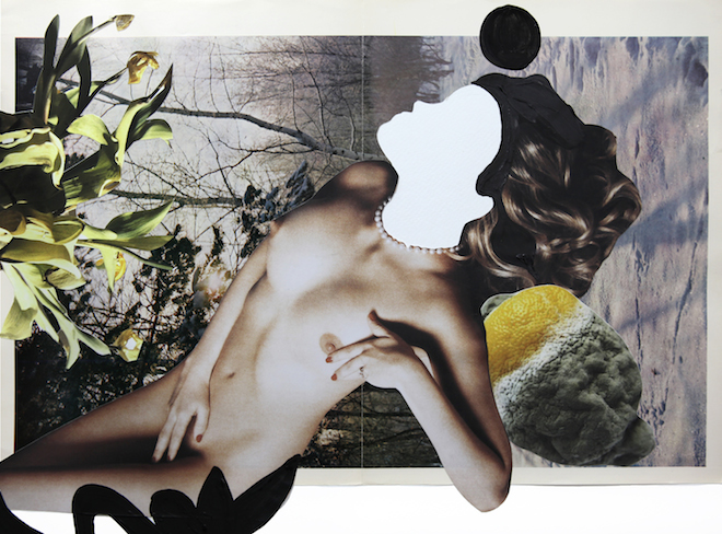
Image 1: Quentin Jones, Adult Series, 2014, acrylic, ink and collage, first published in Adult Magazine. Image 2: Quentin Jones, 2013, photography, acrylic and ink, first published in Flair Magazine. Image 3: Quentin Jones, Self Portrait series, 2014, photography, acrylic and ink, first published in i-D Magazine
Tags: Quentin Jones, Robert Storey, Vinyl Factory
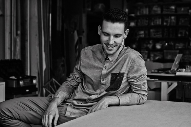
Robert Storey considers himself an artist first and foremost. With the work that he does and the brands that call upon him for set design, who’s to disagree? Having worked with the likes of Opening Ceremony, Nike, Louis Vuitton and Browns Focus (the list goes on), as well as contributing to previous issues of Twin, Storey has quickly carved out a very well-respected place for himself in the industry, were people come to his studio to get that Storey spin on their projects. Twin visited the creative at his studio to talk furniture design, New York and his very first job.
Were you always a creative person?
I was always creative as a kid, always most engaged in art classes or when I was at home. When I wasn’t playing outside with my brother, I was drawing something like a plant that I had brought inside or making something in my dad’s workshop from wood.
What does your dad do?
My dad is a businessman, but he’s an amazing carpenter – really creative, so I grew up around that.
How did you go from sculpture to set design?
I was assisting some artists in New York. I really loved it there so wanted to stay but I couldn’t assist the artists any longer. I then met this guy who was an agent at M.A.P., and he’d had an English set designer come over called Janine Trots. He said I should just work for her for a bit and see if I enjoyed it, so that was a good reason to stay. When I came back to London she set me up working with Shona Heath, so I worked for her and then kind of just rolled into being a set designer. It was quite organic.
If you had the choice, do you think you would have decided to set up your own studio in New York?
I had to come back because of my visa but I always hoped to go back to New York and then set up a studio there. I actually just got my visa to go to America so I can go now, but I’d like to try and be transatlantic rather that based in New York or based in London. I think it’s nice to be in both places as they both reward you in different ways.
What is it about New York that you like?
I think that year that I spent there was really, what’s the word, formative. I made a really good group of friends and I think those people will always draw me back because I like their company. I like how fast paced New York is and there’s always a new restaurant. Everything’s so convenient, if you live in Manhattan or Brooklyn it’s easy to get anywhere and it’s easy to work there. Everyone’s super on it, no one’s faffing around and if they say they’re going to do something, they’ll do it.
A bit different to London.
Yeah it’s all a bit slower in London. You have a meeting and then another meeting before anyone can actually do something. Which I love as well, I’m English and I’m used to that way of working, but I like that immediacy.
Tell me about your first solo gig as a set designer…
There was a guy that was working at Studio Private in Shoreditch producing a shoot, that knew I was doing set design, but he literally needed a really simple backdrop painted and asked me if I wanted to do it. I was really keen; I’d turned up to the meeting with loads of different samples I’d done. Now I wouldn’t even give a sample, but back then I would be drawing all of these different squares and doing different textures inside them. Josh Olins, who was shooting, picked his sample but somehow – I think because I was a bit nervous – I left all my samples on the table and another photographer came to the studio right after my meeting and saw them. He called me asking me to paint a backdrop for him, and then it just rolled on from there really. It was quite quick.
When you’re working on a project, do you get creative freedom or would you say it’s a more collaborative process?
I think increasingly there’s more creative freedom. Because I have developed quite a strong style people come to me because they want what I can give them. I can definitely produce anything and if someone’s got a really strong idea I’m happy to sit back and do it the way they want me to do it but I think, luckily, we get a lot of projects where people want us to put our own stamp on whatever the project is.
So how would you describe your style?
I think there’s a lot of architectural influence. It’s well balanced; there’s a lot of symmetry, a lot of geometry. I always try to make it feel really quite simple even though it’s really complicated.
You do more than just set design; you’re working on brand identity and art direction. Tell me more about what Robert Storey Studio does?
I think the term set design is quite tenuous, just because of the fact that my studio is a creative studio and I come from an artistic background and I consider myself an artist first and foremost. But beyond that we do work with brands to create an identity for them or enhance the identity that they’ve already created for themselves. But I mean like furniture design, interior spaces, pop-ups, runways shows, we do everything.
Is there one thing that’s your favourite?
Everything’s my favourite! I mean if I had to pick, I’d probably do still life but I think I love the diversity of doing a runway show one day, then a tiny still life the next and then a massive shop-build somewhere else. It keeps me on my toes.
What’s been your favourite project to date?
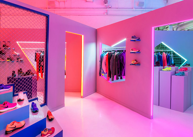
My favourite project would be the Nike [Womenswear Pop-Up] in New York – it was really special.
You’ve got a collaboration coming up with Quentin Jones. Tell me a bit about that?
Quentin and I have been working together for over three years now so we have this really lovely collaborative relationship. Quentin had been asked to do a presentation, like a mini retrospective of her work. She approached me to make the set for it because I know her work better than anyone else who would make a set for her. She’s great, she kind of let me go off and do my own thing and when she came back to it, she loved it, and so it’s been really easy. It’s one of those love projects really.
What are you working on other than that at the moment?
We’ve just started the Christmas windows for Matches. We’re doing it in all six of their stores for Christmas. We’re working on a project for Uniqlo in New York and Tokyo and Paris. We’re doing a few still life stories and we’re doing the Christopher Kane shop in Harrods.
Who would be the ultimate client?
Well Nike was my ultimate client and then I got it, and also Christopher Kane. I really, really want to design a space for Comme des Garçons because I think they have a really innovative, unique approach to how they expect their audience to experience the space. So I think I’d have a lot of freedom to do something really experiential with them. I think Comme des Garçons would be a good one for me.
You mentioned furniture design, what kind of things would you want to build?
My work is all about the space, and filling that space so it’s seems a natural progression to design the objects that go within it. Obviously we design these structures that go into spaces at the moment. I think the more the studio progresses, the more we’re doing the retail spaces or possibly residential spaces; it wouldn’t make sense for me to have another designer design a chair for a space which I have a complete vision for. For me, a chair is just as important as the wall in the space or the image that goes on the wall; it’s supposed to be a collective consciousness.
So what does the future hold for Robert Storey Studio?
I guess to continue this stream of my transatlantic workflow, and to eventually make some furniture of some sort. I’d love to do some collaborations with furniture. I think we need a brand to come to us like Vitro or Ikea to say ‘we want to design a range of chairs’. I’d love to do a really big collaboration project with a really big brand. I have an obsession with big American brands like Levis. Any kind of brands where we can put our name to a project, like Robert Storey x Levis or Robert Storey x Vitro.
storeystudio.com
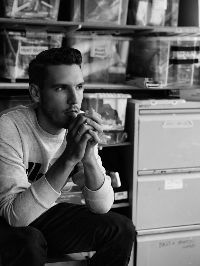
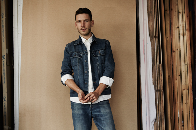
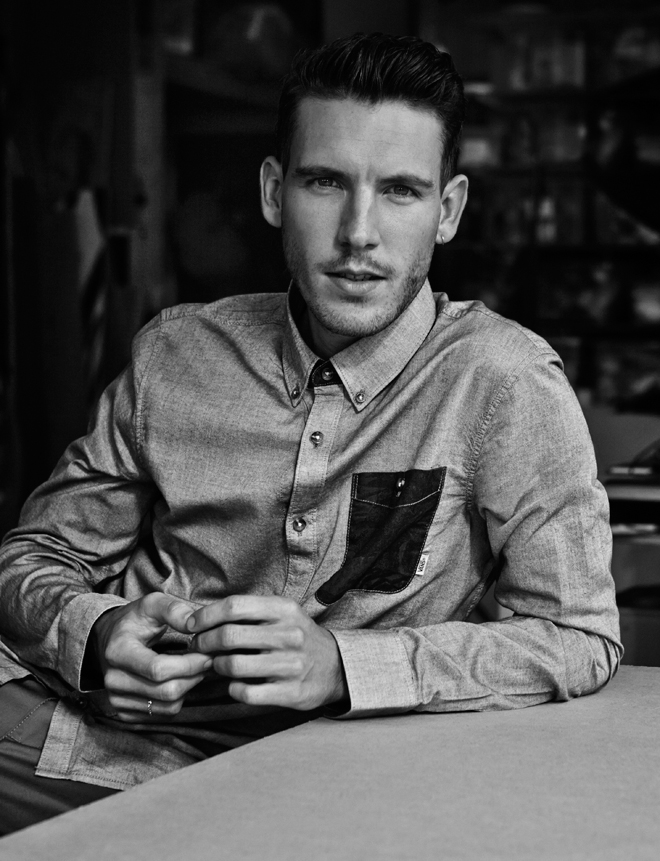
Photographer: Robert Harper
Stylist: Coline Bach Styling Assistant: Susanna Cavallaro
Grooming: Meggie Cousland
Photography Assistant: Pablo Marks
Robert Storey wears Ellesse sweater, Carhartt trousers and his own ring in image one; A.P.C. denim jacket, shirt and jeans in image two and Vans shirt and Carhartt chinos in image three
Tags: Robert Storey
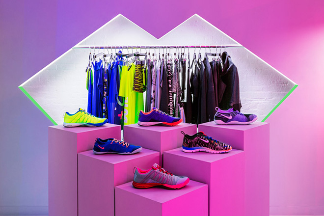
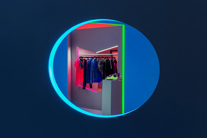
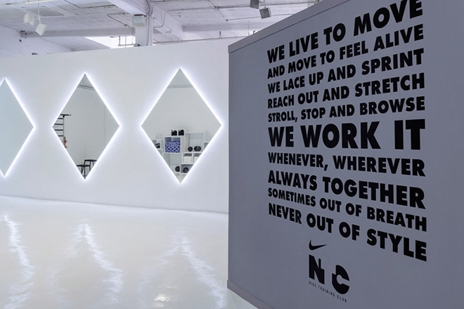
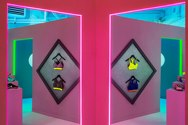
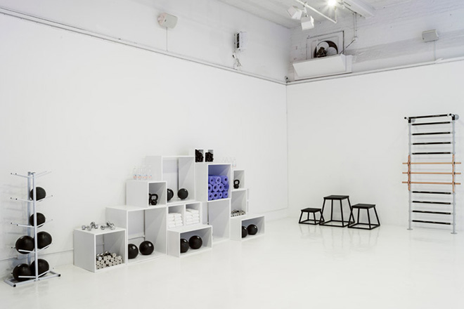
Twin contributor Robert Storey has designed the new Nike womenswear pop-up in New York. The space is broken into distinct areas that include pro bra, train, run and live. Running with the designs within the collections, the space focuses on symmetry and bold colour schemes of blue, green, pink and orange. You’ll also find an all-white gym for lucky visitors to work out whilst trying on the merchandise, as well as a fitting room for bespoke sports bra measuring.
Nike Womenswear Pop-Up – Mulberry Street, New York, NY 10013
nike.com
storeystudio.com
Tags: Nike, NYC, Robert Storey






 Twitter
 Tumblr
 YouTube
 Facebook
 Instagram
